Five Facts About Color Every Marketer Should Know
We use color on a regular basis to express ourselves and project a certain image—whether it’s with the clothing we wear, the car we drive, or the furniture we use to decorate our homes. Color has such a deep and powerful effect on our emotions that most of the time, we don’t even realize we’re being influenced by it.
In fact, the power of color is so strong that around 62 to 90 percent of instant judgments we make about products are solely based on color because our brains pay attention to it before anything else. So, while the actual message of your marketing is still vital to the success of your campaigns, using color is also key to creating meaning. In order to effectively leverage this potent tool in your next campaign, keep the following facts in mind.
New brands should use color to stand out from the competition. People prefer to buy brands they can easily recognize, so in a saturated market, it’s important for companies to use color in a way that makes them stand out from other businesses vying for the same audience. If you know your competitors all use blue for their products, be bold and make a color choice that is sure to stick out in people’s minds.
Consumers expect colors to be appropriate for the product being sold. Although being bold can really increase brand recognition among consumers, they also expect color to be used in a way they find appropriate. When you’re choosing colors, consider whether or not they really fit what you’re trying to sell. While a hot pink logo is a bold choice for a funeral parlor, chances are it would turn off a grieving customer base.
Men and women see color differently. Not surprisingly, men and women experience color in different ways. Men tend to prefer colors that are bold and make a statement, while women like products that have softer, more subdued colors.
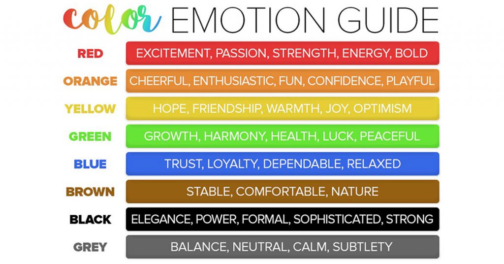
Color conventions are context driven. Although marketing experts believe in some conventions about the use of color in advertising—such as how yellow is associated with optimism, blue is used to make people feel a sense of security, and red is best when you want to create urgency—context also matters. For example, the color green does not have meaning in a vacuum: Sometimes green is used to symbolize money and other times it is associated with environmental issues.
The way people respond to color is highly subjective. Advertising psychology research has provided some clues as to how people may respond to color, but experts also find there are no hard and fast rules. Many factors contribute to the way color is perceived, such as culture, past experiences, and individual preferences.
Color is a powerful tool in marketing—but only if it’s used in the right way. Although you can’t definitively predict how people will respond to your use of color, thinking about these facts can go a long way toward increasing your success.